Of Talents Both Marketable and Non
Last month when my mother came up for a visit, she left behind a tote bag full of shoes—three brand-new pairs of sensible, black leather shoes, to be specific. I called and left a message on her phone as soon as I discovered them, but since she was already on the road and she knows better than to look at her phone while driving, she was already home by the time she got my message. "You left a bag of shoes here!" She was unsurprised. "Yes, because you're going to paint them for me." Oh, right... We had briefly discussed that once, but I had completely forgotten because... I don't paint shoes? I don't paint anything (hardly even my nails these days)... and what the hell do you paint on shoes anyway? I once painted dragons on a pair of Converse All-Stars in high school (and duplicated the same design in washable Crayola Markers on the tiny canvass Keds of a toddler who admired them later that summer), but that was <indecipherable mumble> years ago. "Oh right... Did we happen to discuss what I was supposed to paint on them?" I asked hopefully. "Nope," She replied. "Whatever. I know I'll like whatever you come up with."
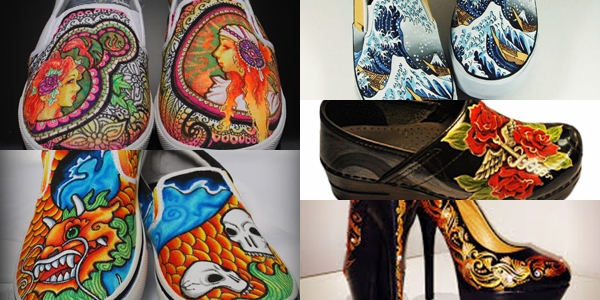
So naturally, I turned to Google, and found that "painting shoes" is apparently a huge creative enterprise... who knew? Even after filtering the results for leather shoes and using "art" as a modifier, I found tons of ideas on Etsy and elsewhere. As an interesting aside, the biggest recurring theme (besides Disney) seemed to be the caduceus—painted in a myriad of styles and settings—always on sensible black leather flats... Hmm (which is the sound of me putting two and two together)... Could creative shoe painting be the newest form of passionate self-expression practised by the nursing community? But I digress.
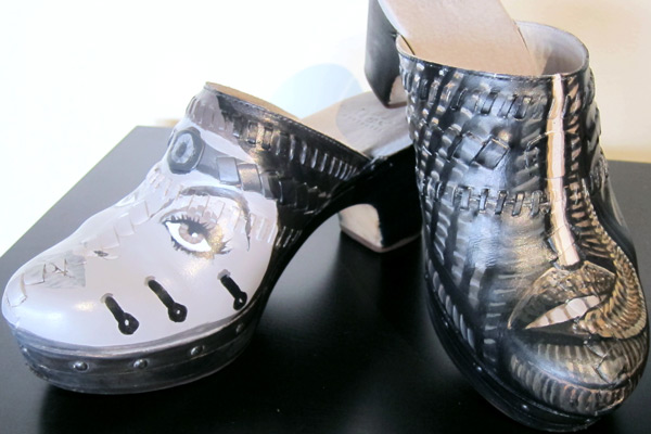
Anyway, I came away with ideas but before I attacked a pair of my mother's perfectly good shoes, I thought I'd better start with a pair of my own, and I knew just the ones—a pair of grey clogs I'd bought on sale because they were the last of their style in my size, but they were such an unfortunate color that I'd hardly ever had occasion to wear them. They were a hideous late '80s computer monitor/ Silly Putty grey that matched absolutely nothing in my wardrobe. After searching for ideas and contemplating various style options, I settled in typical "me" fashion on H.R. Giger, an artist I've admired since the first time I saw Alien in 1986 (in anticipation of the theatrical release of Aliens).

Giger's art is infamously dark in subject matter and tone, almost devoid of color, consisting of extraordinarily intricate, hallucinogenically patterned representations of nightmarish semi-anthropomorphized alien figures blending and transforming into an incomprehensible matrix of biological, mechanical and exoskeletal forms, like M.C. Escher on a near-lethal dose of the worst psychotropic substance imaginable. I had never even thought about attempting to imitate his style, but what the hell. It was a perfect match for my grey clogs.
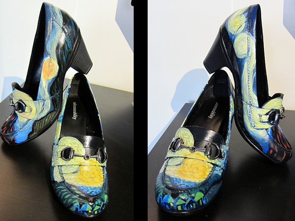
So that worked out pretty well... Next I set out to tackle one of the great masters of Dutch Impressionism, another style I had no reason to believe I could do any justice to (let alone applying it to as challenging a medium as size 7 loafers).
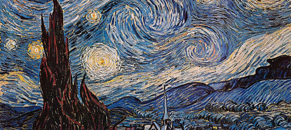
I actually changed my mind halfway through this pair, after my initial aborted attempt to render the famous Japanese tsunami wave (you know the one). I'm not sure if Vincent would recognize the homage, but I was happily surprised I was able to achieve even a passing resemblance to the hypnotically swirling stars in his sleepless masterpiece...
Klimt was an obvious choice for my second attempt, not only because I know my mother actually likes his artwork, but because so many of his most famous paintings are of something I already know how to paint—women!

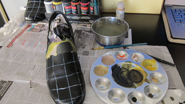
Besides, metallics are soooo much fun. But this called for a bit more of a systematic approach—time to actually make use of something I learned in art school (painting I learned from my grandmother a decade or so before I went to college). I'm talking about the old technique of laying a grid over the work you're copying and mapping the same grid onto your painting surface...
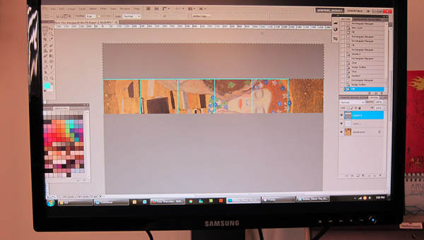
Which allows you to focus on one tiny piece of the overall picture at a time...
Thus ensuring the accuracy of scale and proportion while keeping you focused on the details, neither overwhelmed by the composition nor distracted by the content of what you're painting. I'd only employed the technique once before, when we learned it in my Fundamentals of Design class—perhaps not coincidentally, I also chose to paint "The Kiss" for that assignment. Unfortunately, I have no idea what happened to it but I think this one turned out better anyway.
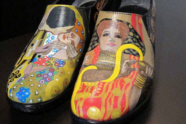
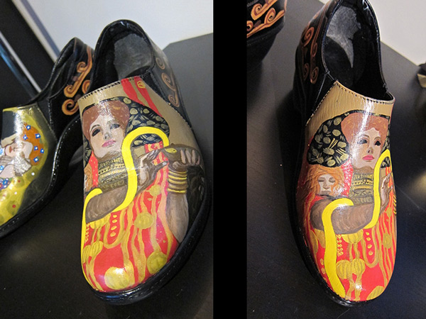
On the right above, and in both pictures below, is Klimt's slightly less universally-famous Hygieia (Greek goddess of health and hygiene, daughter of Asklepios), which was a detail in his larger painting, Medicine, the unfortunate tale of which can be found in "Doctors versus artists: Gustav Klimt's Medicine," an article published by the NIH. (It bears repeating here, those fucking Nazis.)
I can see this becoming addictive. Yay, another unmarketable skill to add to my imaginary resume! It can go right between overly ambitious nail art and Russian pattern translation... Now I just have to decide what to paint on the third and final pair of shoes for my mother before next weekend...


